My Predictions For 2013 Gold And Silver: Good Stocks And Bonds: Bad
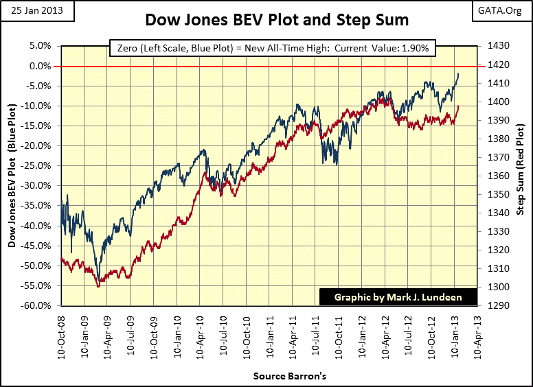
Well, it appears that the Dow Jones is going to take out its last all-time high of October 2007, even as market trading volume is collapsing. That fact alone should make us wary of the stock market, but the Dow Jones doesn’t seem to care; the Dow has increased by eleven BEV points since 14 Nov 2012 and is now just a hair away from breaking upward to a new all-time high. But what then?
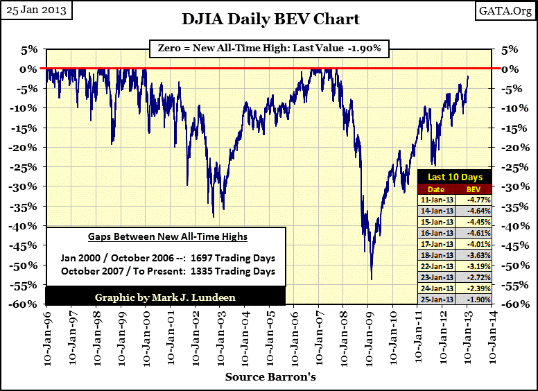
But my heart today just isn’t in the stock market, nor is the general public responding to the rebounding Dow Jones as it once did. There was great excitement on the floor of the NYSE from March 1999 to January 2000 as the Dow Jones broke above 10,000 and continued making one new all-time high after another for the next year. The same was true from 2005-2007 when the Dow Jones recovered from a 38% bear market bottom in October 2002 and continued making new all-time highs from September 2006 to October 2007. Six years ago as the housing market was sizzling, the Dow Jones going from one all-time high to the next. There was a general feeling of euphoria that happy days were here again just before Wall Street began sliding down into the second deepest bear market since 1885.
Since March 2009, I get the feeling that the public now understands that losing money on Wall Street is easier than making it, but it’s more than just that. People in general don’t have the money to invest in the stock market as they once did. Today, most income generated by the public is now going toward necessities and servicing a few hundred thousand dollars in debt taken on during the housing boom. It’s one thing to have lost big money from the high-tech bubble. However losing big money in the housing bubble also came with a thirty year mortgage that must be serviced for decades to come. The current market malady is due to the lack of means, and the public’s lack of desire to play in a game that they always seem to lose. So why is the Dow Jones rising up to a new all-time high? As Chairman of the Federal Reserve, Doctor Bernanke can never run out of money.
The Dow Jones’ step sum chart looks good. Both the Dow Jones’ price and step sum’s trends are rising sharply. However this is a “strong buy signal” I’m going to pass on because I just don’t like the stock market in 2013. It’s so contrived. The only reason the Dow Jones going up is because the “policy makers” are spending their inflationary dollars in the stock market to create a feeling of normalcy in the economy; however the economy isn’t normal.
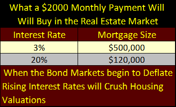
Unemployment has been chronic since 2009 with no sign of improving, and the housing market is still in danger of declining. Rising interest rates from a bond market debacle will devastate current housing valuations. Here is a London Telegraph article reporting that Bank America has issued a “Bond Market Crash Warning” on fears that the Federal Reserve might begin to rise interest rates. Funny, but I don’t believe this was reported on CNBC. A Crashing US Treasury Bond market implies to me, if to no one else, that bond yields, and mortgage rates are likely to see double-digits. They have been there before. In September 1981, the US Treasury issued a 20 year bond with a 15.75% coupon, and mortgage rates saw 18%. It’s a mistake believing interest rates can’t see or exceed the highs of 1981!
Remember, people really don’t buy a home, what they actually do is rent money from the bank for thirty years. Legally speaking, the house is only the bank’s collateral that “home owners” are allowed to live in as long as the make their monthly payments. Whether mortgage rates are at 3% or 20%, the excess income needed by a prospective home buyer to make a monthly payment is essentially unchanged, provided they can remain employed. For example, should the extra cash needed to service a mortgage be $2000 a month, the difference in size a bank can make for a mortgage at 3% or 20% is huge.
We are still a long way before we see the end of the housing bubble’s impact on the economy.
Also electrical power consumption is nowhere near returning to pre-credit crisis levels. Any number of external events could bring down the economy including, but not limited to: China declaring gold backing for the Yuan; a Middle East war resulting in disruption of oil exports; OPEC demanding gold in payment for oil; a shooting war breaking out between China and Japan or China and Taiwan; China, Japan or a group of other countries dumping US Treasuries en masse. When interest rates once again return to historical levels (5% to 7%), this house of cards is going to come down.
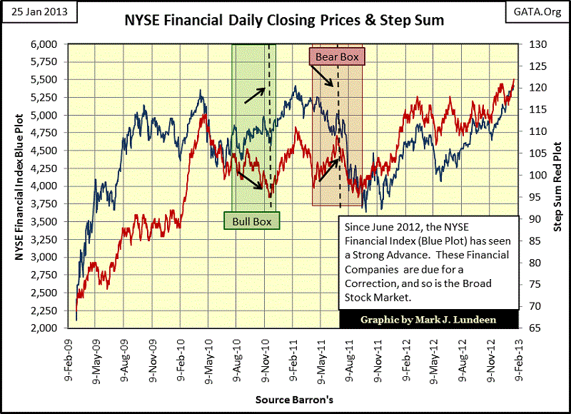
The NYSE’s Financial Index is going up too, but like the Dow Jones, I’ll take a pass. These companies no longer finance industry and commerce. Well that’s not exactly true, but the main reason they now exist is to function as an arm of the Federal Reserve System as it manipulates market valuations. Most of these companies would have gone bust in 2008-09 had the US Government not bailed them out. Their financial reserves are only liquid because the Federal Reserve is buying their toxic mortgages and derivatives with the Fed’s continual quantitative easings. Butthat doesn’t mean people can’t make money on these banks if their share prices continue to go up. If they do, they will go up without me.
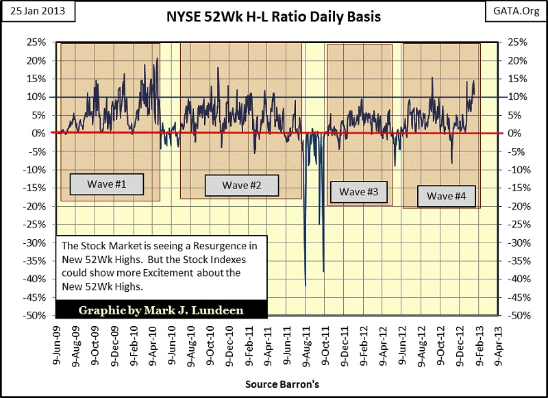
Since December 21, Wave #4 has seen a surge of new 52Wk highs at the NYSE. It’s a sign of strength – I guess. But the day is coming when the stock market will once again see many more 52Wk lows than highs.
“Experts” continue expecting the stock market will benefit from rising interest rates, but I don’t! From 1920s to the 1980s earning trends had little to do with the Dow Jones’ price trend. But during the 1990s (during the Greenspan Fed), they mysteriously became bolted together. So, now after two decades of seeing price and earning trends rise and fall together, people’s expectations today are that a huge decline in earnings would be a disaster for the Dow Jones valuation.
Look at the huge decline in earnings for the Dow Jones during the credit crisis below. They fell almost instantlyfollowing the derivative disaster in the housing market. I expect that market history will one day record that this huge decline was due to the Dow Jones companies’ derivatives portfolios cratering, and so sucked the cash from the thirty Dow Jones companies and the S&P 500. Then just as mysteriously, during a period of high unemployment and declining economic activity (as reflected by EP), the earnings for the Dow Jones increased to record levels just a few years later.
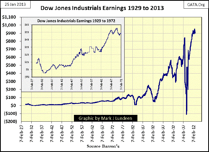
How does this happen? I suspect that both the decline and resurrection in the Dow Jones and S&P500 companies’ earnings were due to derivatives sold to them by their investment bankers. Since the credit crisis, nothing has changed on Wall Street as far as derivatives are concerned. So should interest rates increase in a bond market collapse, I expect to see the Dow Jones’ earnings once again go deep into negative territory. How could thatpossibly be positive for the stock market?
Since the Dow Jones appears to be on track to exceed its last all-time high of October 2007, how are the other major stock indexes doing? Here is a table showing their performance since October 2007, along with the BGMI, XAU and gold and silver. Look at the last column, displaying the number of days since their last all-time high. The indexes with zero days just made a new all-time high today. But it’s been 1935 days since the Dow Jones made its last all-time high, as is also the case for the S&P 500, the Russell 3000 (small caps) and the Wilshire 5000 (the broadest measure of the market, a market cap weighted index of all stocks actively traded in the United States); that’s a long time.
The column to the left “Current BEV” tells us how many percentage points the index is off its last all-time high. Many of these indexes are less than 5% away. But the indexes containing bank stocks are still over 40 BEV points (40%) below their last all-time highs, and to me that is an indication of market weakness. These companies have received trillions of dollars of free money from Doctor Bernanke, and changes in accounting rules, but are still more than 40% below their highs of 2007? And don’t ever forget that when these companies began to crash in 2008, they took all the other indexes in the table below with them!
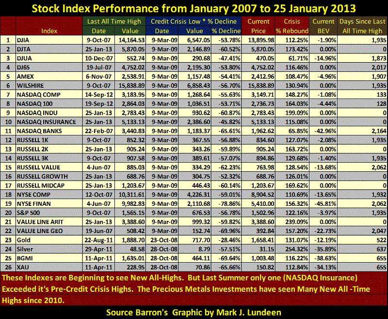
The last time I posted this table was July 2012, six months ago. With the exception of gold, silver and the gold miners, last summer had only one index that exceeded its credit crisis high; the NASDAQ Insurance index (#10). Look at gold, silver and the precious metals miners (#23-26). All are currently suffering from a correction (see current BEV column) that has gone on now for two years, but I believe are due for a reversal to the upside sometime in 2013. But even now during a 30% correction, #23-26 above have done well when compared to #1-22.
Look at the “Crisis % Rebound” column that lists the percentage gains from the bottom of the credit crisis. Silver (#24) is currently -34% from its highs of April 2011, yet it’s the best performing asset in the table. The closest index to silver’s gains is the Value Line Arithmetic index (#21), which only began making new all-time highs in the last month.
This table is worth a few moments of study. Keep in mind that these stock indexes have been increasing (slowly) for quite a while, and so are due for a market correction, while the gold and silver assets haven’t seen a new all-time high for some time. Yet these stock market’s indexes are not putting the precious metals investments’ to shame.
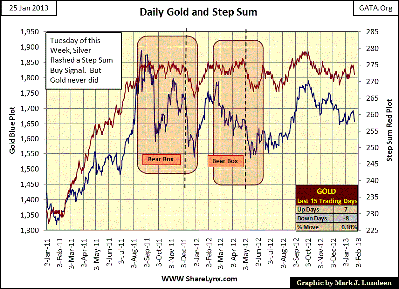
I called a step sum “strong buy” for silver this week on Tuesday. At the close of Friday I’m having my doubts about that. We will just have to wait until next Friday to see if I was a genius, or a dog on that call. Hey, I don’t guarantee my work. After all, this is just my personal technical work that I share with my readers. The only things I guarantee is that if you make money on my charts and comments, I won’t ask for a percentage of your profits. I also guarantee that if you take a loss, I’m not going to reimburse your capital account. We all take our gains and losses like adults.
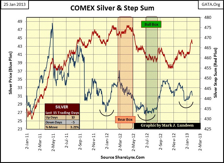
But in fact, silver’s BEV chart is still looking good. Its reverse head & shoulder formation is still holding, which I believe is for a darn good reason; silver is in short supply. The US and Canadian mints can’t find enough silver to continue their 1 ounce bullion coin production; that, as well as other silver market news of lack of supply to satisfy growing demand tells us the price of silver is just too low. How high must silver rise to correct these silver market shortages? High enough to where supply equals demand, and right now demand is overwhelming supply. Seeing silver at $150 sometime in 2013 an ounce wouldn’t surprise me. So I believe that silver selling for $31 won’t last much longer.
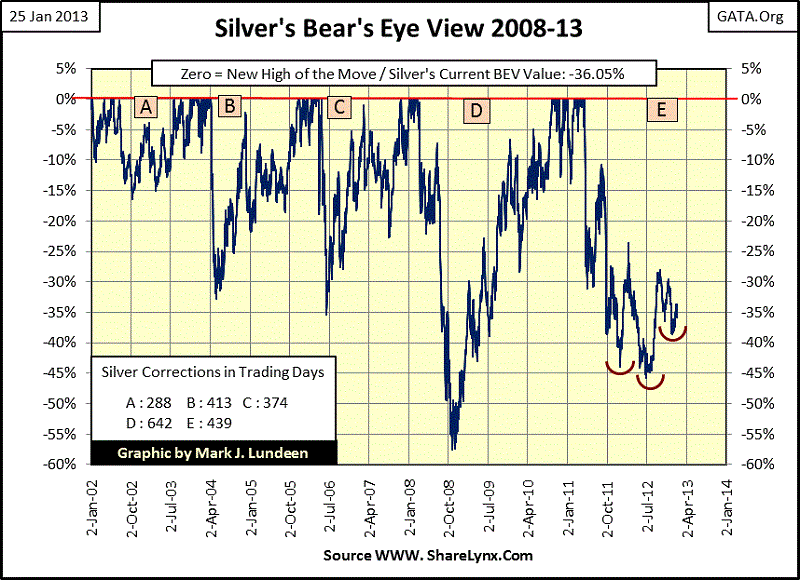
Gold’s step sum chart isn’t doing anything for us. Hopefully sometime before April we’ll see it and silver flash another strong buy signal where both the price and step sum trends move boldly upwards. But we just have to take this day by day.
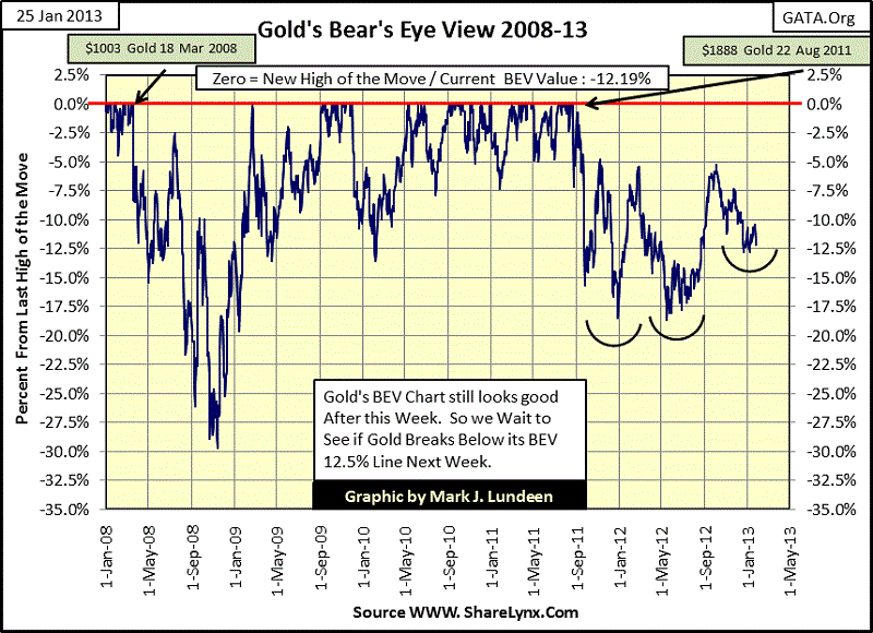
Gold’s BEV chart, like silver’s is still looking very good.
So what is there to say for the last Friday of January 2013? Not much really; other than the stock market continues to rise as trading volume continues to decline. That plus gold, silver and the gold mining shares are actually holding their own when compared to the surging stock market, even though they are still in a two year correction. This news may not be exciting, but it’s good to know anyway.


