Silver vs Gold
I just happened to stumble across the chart below, which is a 5% X 3 box reversal of the RATIO of silver to gold.

This chart really caught my eye. What it shows is a perfect equilateral triangle, that is now coming close to a decision point from which it must either break up or down. Effectively, the market is reaching for a point of decision.
Why does this interest me? It could be argued that this is just one more "grey" and indecisive fact. Yes it could. But what this triangle is telling me is that we are very close to a period of high volatility in the markets in general.
Why? Well, let's consider the options: Either silver is going to break up strongly relative to gold, or gold is going to break up strongly relative to silver. But the emphasis is on "strongly"
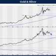
Could it be that gold is going to break up strongly? Let's have a look at a long term chart.
The following chart says "yes", with a vertical count upside target (more reliable in a primary bull market) of $599, and a horizontal count upside target of around $500.

What about silver?
This chart shows an upside target for silver of around $12 based on horizontal count methodology (assuming silver breaks up).

So, if Gold "could" rise from $430 to $500 (16%); and silver "could" rise from $7.15 to $12 (67%), then a break up from the triangle in the Relative Strength Chart above is quite within the bounds of possibility.
Unfortunately, silver could just as easily break down, and fall from $7.15 to $5.40 (24.5%) even as Gold rises by 16%, and so a break down from the triangle in the Relative Strength Chart above is also quite within the bounds of possibility.
The alert reader will have spotted the fact that both scenarios assume an upside move in gold of 16%.
So where does this leave us?
It leaves us with a clear understanding that the silver market is thoroughly confused and undecided; but that the gold market seems solidly locked into the saddle of the bucking bronco.
What do we do?
Hold tight in both gold and silver, and be prepared for some rough rides in the short term. There are no reliable technical "techniques" that one can use at this point to give you any comfort. Decisions at this point will be based on fundamental analysis.
The "real" issue with silver is that in the event of a recession, industrial demand could wane just as supply starts to increase as the new mines start to come on stream.
Well, if this is a real probability, why take the risk? Why bother with silver?
The reason is "technical"
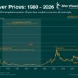
The following chart shows a "washout" has occurred, and that a bounce within an ultra long term trend is due.

This is a 600 year graph of silver prices and silver/gold ratio from 1344 to 1998 as shown in 1998 dollars.
Source: http://goldinfo.net/silver600.html
Even a bounce back up to the steeply falling trend line will take silver to around $30 in 1998 dollars. That's not bad for a bear market rally!
And if the ratio of gold:silver falls to around 20X, this will imply a gold price of around $600 an ounce which, wouldn't you know, is roughly what the long term gold chart is calling for (note: This chart is a few months out of date, but the upper dashed trend line still represents a potential upper boundary at around $600)

OK. Now, we're back on track. Yes, we may be wrong, but at least we have a view that can be defended from both a technical and a fundamental perspective.
There is a logically defensible reason to stay on board for the long haul, despite all the short term uncertainty. But let's not lose sight of one question: In the context of a downward pointing 600 year chart, what the hell does a "Primary Bull Market" mean?


